Building a Whitelabel
E-commerce Ecosystem
End-to-end UX design of a custom enterprise platform — from business needs to tested product.
[Preview only – full case available
on desktop 💻]
OVERVIEW
The project was commissioned by a major Italian tech company, a leader in digital services such as hosting, domains, and data center infrastructure, with over 1,000 employees.
The goal was to design a scalable whitelabel e-commerce ecosystem, initially built for internal use but with a long-term vision of productizing it for third-party resale.
The platform was conceived as a custom enterprise solution, with complex flows, modular architecture, and distinct user groups — from super admins to shop operators — requiring flexible yet consistent user experiences.
ABOUT THE PROJECT
Role:
Senior UX Designer
Time:
Feb 2023 - Nov 2024
(UX completed, dev in progress)
Team:
4 UX Designers, 1 Product Owner,
3 Business Analysts, Dev Team
Cient:
Name withheld due to confidentiality agreements
Key Challenges
UX DESIGN CHALLENGES
→
Designing a scalable and modular information architecture
→
Translating ambiguous functional requirements into clear UX flows
→
Maintaining usability across enterprise-level complexity
→
Adapting flows for multiple user types and access levels
→
Designing within an existing, dense Design System
→
Prototyping configurable flows in a customizable white-label system
→
Supporting a gradual release strategy with iterative UX delivery
→
Aligning UX with legacy systems and backend logic
ORGANIZATIONAL
& TEAM-RELATED CHALLENGES
→
Inheritance of leadership mid-project: Took over from the previous lead, reorganizing the team and clarifying priorities across active streams
→
Working fully remotely with a newly formed team
→
Managing large volumes of documentation and synthesizing it efficiently
→
Collaborating with non-UX teams (e.g., devs, business analysts, mkt)
→
Navigating stakeholder expectations and managing conflicting feedback
→
Building trust and ownership as a new Senior UX in a complex environment
The Process
UX RESEARCH
→
INFORMATION ARCHITECTURE
→
HIGH-FIDELITY PROTOTYPING
→
HANDOFF PHASE

UX Research
BR Analysis
Workshops
Benchmark
Functional mapping

IA

High-Fidelity

Handoff Phase
Phase 1 → UX Research
Business Requiriments Analysis
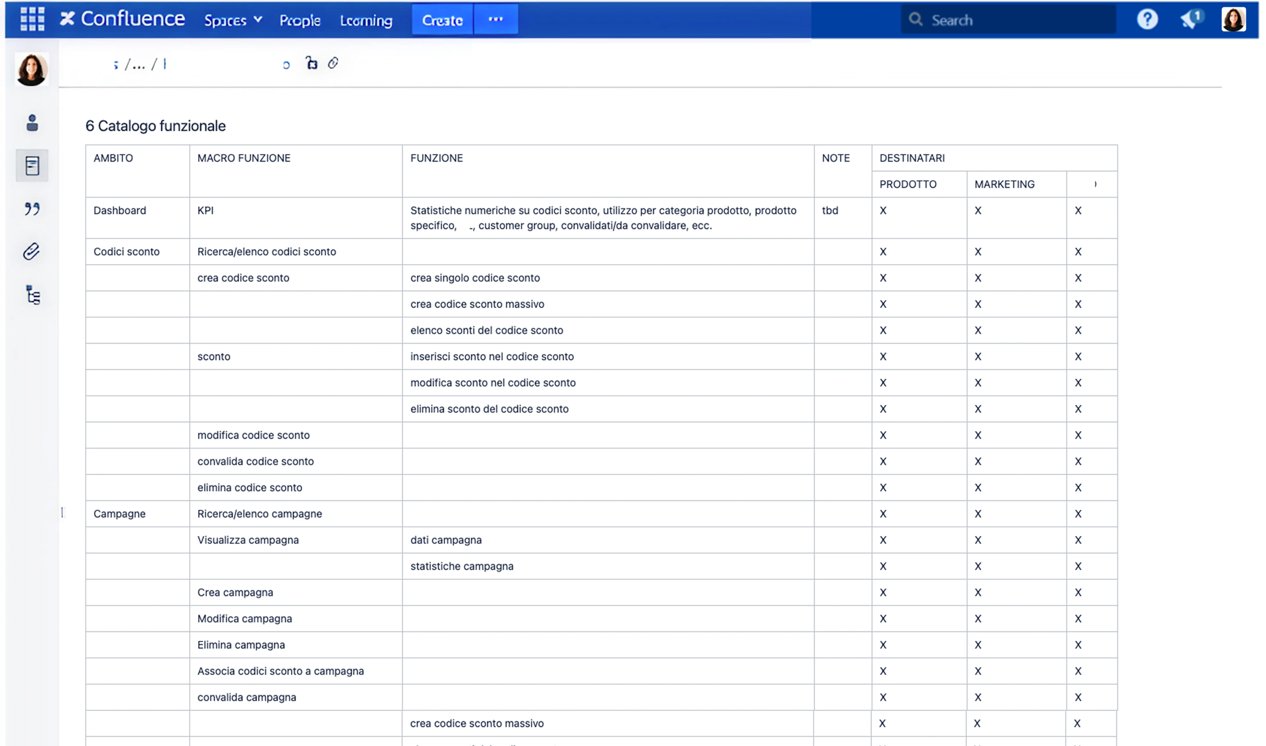
The project kicked off with the collection and deep analysis of the Business Requirements (BR) provided by the client.
We carefully reviewed, organized, and mapped the material to understand the scope, identify key functional areas, and outline initial questions.
This preparation phase was essential to structure the next step of stakeholder workshops.
🎯
Goal:
Align on business priorities and system constraints to set a realistic scope
💬
Insight:
Legacy limitations made it clear that simplification and clarity had to guide all design choices
UX Research
BR Analysis
Workshops
Benchmark
Functional mapping
IA
High-Fidelity
Handoff Phase
Phase 1 → UX Research
Stakeholder Workshops
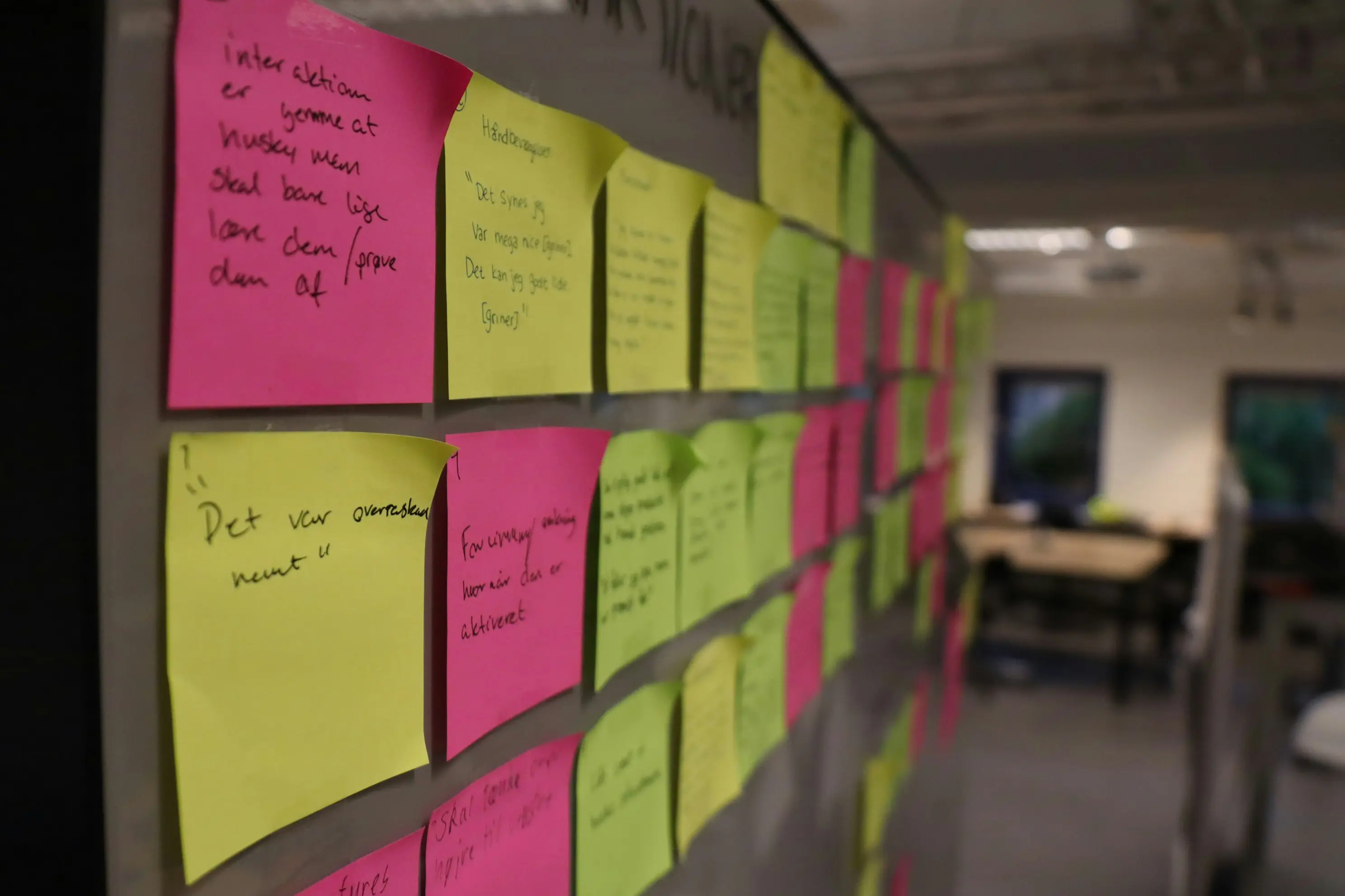
We organized a series of collaborative workshops with brand representatives, functional analysts, and the dev team.
The goal was to validate or redefine functionalities mentioned in the BRs and to resolve technical ambiguities, especially regarding the PIM & configuration flows.
🎯
Goal:
Collect multiple perspectives and resolve functional ambiguities
💬
Insight:
Operators revealed that customer identification was always the real starting point, shifting the homepage from Dashboard → Customer Search
UX Research
BR Analysis
Workshops
Benchmark
Functional mapping
IA
High-Fidelity
Handoff Phase
Phase 1 → UX Research
Benchmark
We analyzed a range of B2B and B2C platforms (including Shopify, Liferay, and PimCore) by directly navigating demo environments or test instances. The goal was to gather UX references, understand structural patterns, and inform our thinking before defining the Information Architecture.
This was an exploratory activity — we didn’t create formal deliverables, but used these insights to align internally and validate design directions.
🎯
Goal:
Explore best practices from B2B/B2C systems to inspire solutions
💬
Insight:
B2C patterns could not be applied directly; they required adaptation to match the complexity of B2B operations
UX Research
BR Analysis
Workshops
Benchmark
Functional mapping
IA
High-Fidelity
Handoff Phase
Phase 1 → UX Research
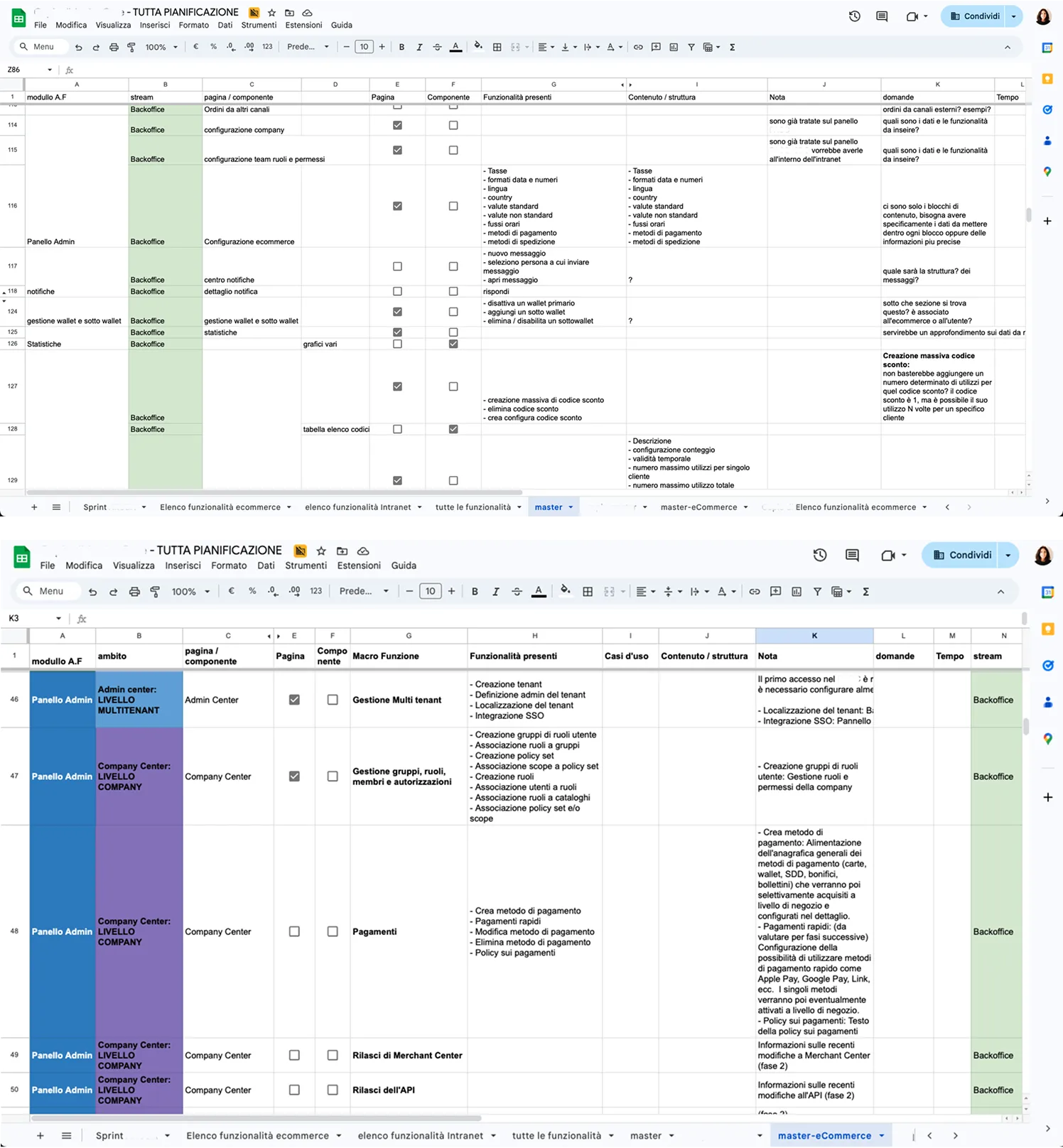
Functional mapping
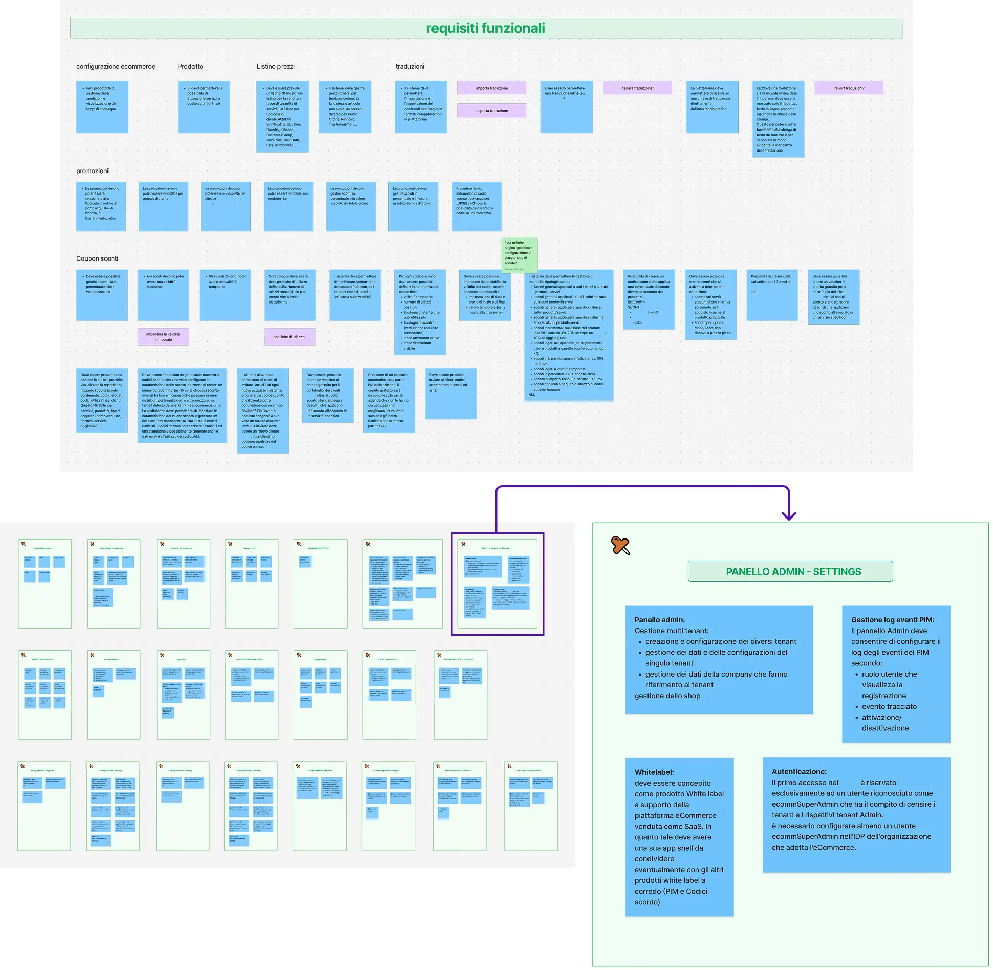
All findings were consolidated into a clear and actionable synthesis. We structured the outputs into functional clusters and user tasks, laying the groundwork for the next phase: Information Architecture. We used FigJam to organize documentation, workshop outcomes, and inputs from multiple teams in one shared and navigable workspace.
🎯
Goal:
Consolidate findings into clear functional clusters and user tasks
💬
Insight:
A shared workspace in FigJam helped unify scattered inputs and prepared the ground for IA design
PHASE 1 SUMMARY
→
Prioritized simplicity due to legacy constraints
→
Reframed homepage as Customer Search
→
Identified transferable patterns but adapted them for B2B
→
Created functional synthesis as a foundation for IA

UX Research

IA
Functional Analysis
IA
High-Fidelity
Handoff Phase
Phase 2 → Information Architecture
Functional Analysis
Once the research phase was completed, we moved on to the information architecture design of the platform.
We defined the core functionalities and mapped the key system sections, based on the priorities aligned with the project team.
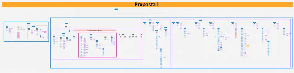
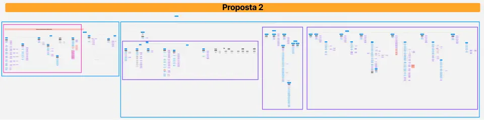
Several meetings were held with the project team to present two IA proposals. After evaluating different perspectives and testing scalability, we aligned on the most functional and future-proof structure.
🎯
Goal:
Define system sections based on service logic and project priorities
💬
Insight:
Workshops exposed gaps in functional specs, making UX facilitation critical for alignment
[Preview limited on mobile – see full case on larger screen]
The main difference between the two proposals concerned where to place the shop configuration section (localization, taxes, payments, shipping, etc.).
It was not initially clear—based on the Business Requirements and inputs from the Business Analysts — whether these settings should belong to the single project’s management panel (Project Center), or if they were to be managed exclusively by the Super Admin, and therefore placed at the Tenant level.
UX Research
IA
Functional Analysis
IA
High-Fidelity
Handoff Phase
Phase 2 → Information Architecture
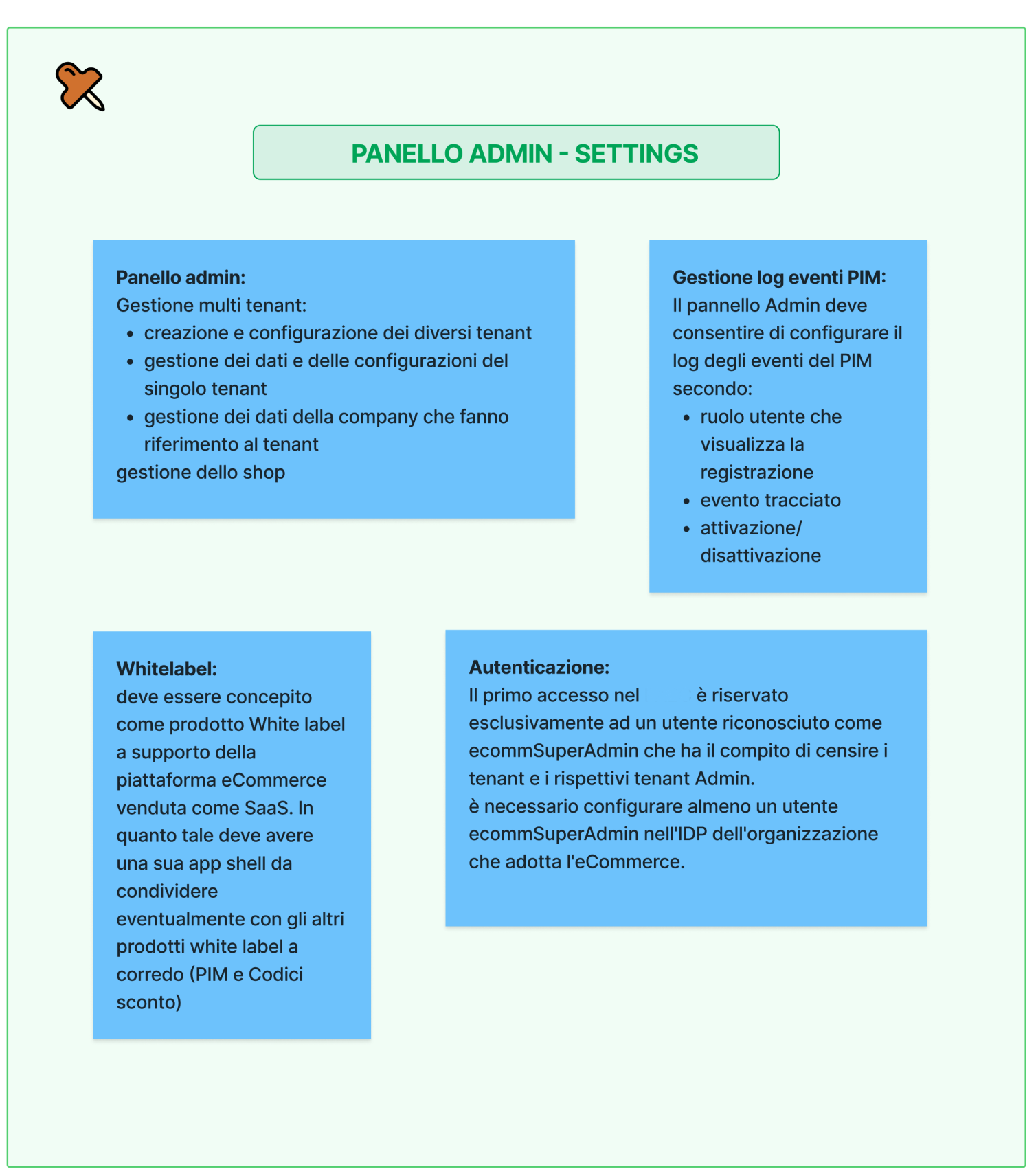
Information Architecture
The system is structured into two main functional areas, designed to support the scalable governance and configuration of multiple whitelabel e-commerce platforms:
Admin Center:
→
Creation of Project Centers: each Project Center represents a configurable shop sold to end clients
→
User management: the Super Admin creates and manages accounts for users who will access the e-Commerce Portal
→
Governance & permissions: role definition, access levels, and multi-tenant management
e-Commerce Portal:
→
Shop Admin: - Project data & parameters, Sales channels, Localization
& taxation, Shipping & payment methods, User, roles & permission management -
→
Promotions: - Discount codes, Promotional campaigns -
→
PIM (detailed in a dedicated project section): - Catalogs, products, categories, and product types -
→
Orders & Quotes: Order monitoring and quote generation
→
Shopping Cart: Started carts and associated users
🎯
Goal:
Establish a scalable navigation structure supporting governance across multiple whitelabel shops
💬
Insight:
Differentiating Admin Center vs. e-Commerce Portal clarified roles, permissions, and flows
[Preview limited on mobile – see full case on larger screen]
📆
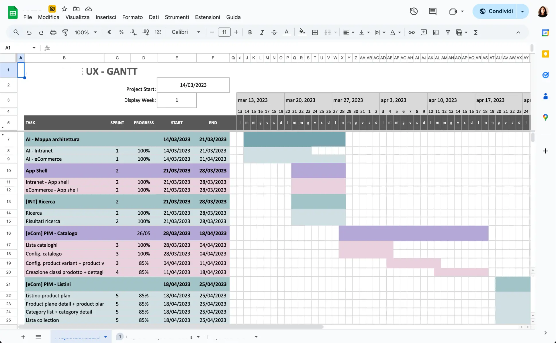
Planning & Release Roadmap:
Once the overall IA was approved, we collaborated on defining a shared release roadmap, including a Gantt chart structured by feature clusters and release priorities.(This planning was done closely with my UX Team Lead; later, I independently led roadmap and planning — detailed in the “Intranet Platform” case study).
PHASE 2 SUMMARY
→
Clarified system sections and dependencies
→
Split architecture into Admin Center vs. e-Commerce Portal
→
Created scalable foundation for multi-tenant governance
UX Research
IA

High-Fidelity
Our UX Approach
What We Prototyped
Complex UX Flows
Improvements
Documentation
Handoff Phase
Phase 3 → High Fidelity Prototyping
Our UX Approach
In agreement with the client, we worked directly in high-fidelity prototyping, using the existing Design System. The first step involved building the Navigation menu — the main structure of the navigation and layout.
This initial output gave the team a clear overview of the platform and helped speed up the development process.
🎯
Goal:
Create high-fidelity prototypes leveraging the design system for immediate validation
💬
Insight:
Defining consistent patterns (e.g., modal-first creation) ensured coherence and faster onboarding
[Preview limited on mobile – see full case on larger screen]
UX Research
IA
High-Fidelity
Our UX Approach
What We Prototyped
Complex UX Flows
Improvements
Documentation
Handoff Phase
Phase 3 → High Fidelity Prototyping
What We Prototyped
Each section was prototyped based on use cases shared by the Business Analysts, following the roadmap outlined in the Gantt chart.
Depending on the complexity, some flows were mapped beforehand, while others were directly explored through high-fidelity prototyping.
Prototypes were validated in joint sessions with the core team (PO, developers, and Business Analysts), where we gathered feedback, iterated designs, and redefined flows when needed.
🎯
Goal:
Test core flows against operator needs and dev feasibility
💬
Insight:
Prototypes confirmed that navigation matched operator mental models, reducing training overhead
USE CASE
(BA)
PROTOTYPE
(UX)
VALIDATION SESSION
(PO/DEV/BA)
ITERATION &
REDEFINITION


UX Research
IA
High-Fidelity
Our UX Approach
What We Prototyped
Complex UX Flows
Improvements
Documentation
Handoff Phase
Phase 3 → High Fidelity Prototyping
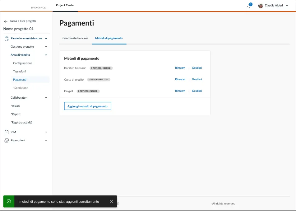
Complex UX Flows: Focus on Payment Methods setup flow
This section highlights the configuration flow for e-commerce payment methods, managed entirely within the internal backoffice.
The decisions made here directly impact what end users will see during checkout—making this a critical area for both business operations and user experience.
[Preview limited on mobile – see full case on larger screen]
UX Research
IA
High-Fidelity
Our UX Approach
What We Prototyped
Complex UX Flows
Improvements
Documentation
Handoff Phase
Phase 3 → High Fidelity Prototyping
Complex UX Flows: Focus on Discount Codes setup flow
This section required collaboration with the Marketing team, who manage promotions and discount codes.
Their main requests included:
→ The ability to save and reuse promo templates, to speed up operations (e.g., when creating a discount during a support call)
→ Mass duplication of existing campaigns (e.g., Black Friday, Christmas), reducing repetitive work
[Preview limited on mobile – see full case on larger screen]
UX Research
IA
High-Fidelity
Our UX Approach
What We Prototyped
Complex UX Flows
Improvements
Documentation
Handoff Phase
Phase 3 → High Fidelity Prototyping
Iteration & Improvements
During the high-fidelity prototyping, some flows turned out to be incomplete or unclear once translated into actual interface scenarios.
Concrete example:In the “Shop Team Management” section, the logic involved assigning users to a shop. However, it wasn’t defined where those users were created, making the assignment flow infeasible at that point.
We escalated this issue to the team and redefined the flow by introducing user creation in the “Admin Center” section.
To support this decision, we created a visual schema outlining the structure and content of each section. This visual aid was crucial: until the team saw it, it was difficult to align on the new logic or demonstrate the usability benefits of this structure.
🎯
Goal:
Refine flows through feedback and feasibility checks
💬
Insight:
Visual schemas exposed hidden gaps (e.g., user creation logic), enabling decisive alignment with devs
UX Research
IA
High-Fidelity
Our UX Approach
What We Prototyped
Complex UX Flows
Improvements
Documentation
Handoff Phase
Phase 3 → High Fidelity Prototyping
Documentation
At the end of each section, we created structured internal wiki documentation to support both handoff and onboarding for development and business teams.
🎯
Goal:
Build a single source of truth for specs and decisions
💬
Insight:
Clear documentation reduced misalignment and supported incremental delivery
[Preview limited on mobile – see full case on larger screen]
PHASE 3 SUMMARY
→
Prototyping validated flows and operator usability
→
Reinforced system-wide patterns for coherence
→
Deep dives ensured critical flows were scalable
→
Documentation reduced handoff friction
UX Research
IA
High-Fidelity

Handoff Phase
From UX to Dev
Phase 4 → Handoff Phase
From UX to Dev
After final validation, the prototypes were handed off to the development team.During implementation, we supported the process with an ongoing functional QA cycle:
→ Review of test outputs
→ Quick UX adjustments and fixes
→ Ongoing alignment sessions to adapt flows based on emerging technical constraints
(The project is currently in advanced development, with several sections already released in test environment and others in progressive rollout.)
PHASE 4 SUMMARY
→
Ensured handoff continuity through QA cycles
→
Reduced rework via early dev alignment
→
Delivered annotated prototypes for traceable implementation
Learnings & Takeaways
This project was a true training ground — from managing complexity to designing at scale and collaborating with both technical and strategic teams.
Below is a summary of key challenges → actions taken → skills developed.
→
Enterprise project, first time: studied requirements, designed scalable IA → gained B2B SaaS & backend UX experience
→
New team dynamics: onboarded fast, led flows → built leadership & adaptability
→
Unclear requirements: synthesized docs, asked the right questions → sharpened systems thinking
→
Tech-heavy language: turned dev specs into usable flows → grew in cross-disciplinary mediation
→
No reference screens: envisioned structure before UI → trained design foresight
→
Unclear roles: raised questions, redefined flows → improved critical & strategic thinking
→
Tight timeline: delivered in iterations with hi-fi prototypes → honed time management
→
Dev handoff: supported QA, tested and validated → practiced full-cycle UX
→
Rigid design system: reused components smartly → ensured consistency & sustainability
→
With Marketing team: coordinated microcopy → gained UX writing clarity
→
Info-heavy meetings: wrote concise notes → boosted operational synthesis
→
Evolving scope: adapted quickly, redefined flows → strengthened resilience
MORE PROJECTS
Enterprise Solutions / B2B Platform / Complex Workflows
Corporate Intranet
Platform
Transforming a legacy internal tool into a scalable, task-oriented intranet for customer service operators.
View Case Study
FINTECH / MOBILE APP / UX FLOWS
Push Notifications for Mobile Banking app
Enhancing UX with a clear and scalable communication system
View Case Study

SaaS SOLUTIONS / FROM COMPLEXITY TO CLARITY / SEAMLESS USER JOURNEYS
Building a Whitelabel
E-commerce Ecosystem
for a Global Tech Company
End-to-end UX design of a custom enterprise platform — from business needs to tested product.
OVERVIEW
The project was commissioned by a major Italian tech company, a leader in digital services such as hosting, domains, and data center infrastructure, with over 1,000 employees.
The goal was to design a scalable whitelabel e-commerce ecosystem, initially built for internal use but with a long-term vision of productizing it for third-party resale.
The platform was conceived as a custom enterprise solution, with complex flows, modular architecture, and distinct user groups — from super admins to shop operators — requiring flexible yet consistent user experiences.
ABOUT THE PROJECT
Role:
Senior UX Designer
Time:
Feb 2023 - Nov 2024 (UX completed, dev in progress)
Team:
4 UX Designers, 1 Product Owner, 3 Business Analysts, Dev Team
Cient:
Name withheld due to confidentiality agreements
Key Challenges
UX DESIGN CHALLENGES
→
Designing a scalable and modular information architecture
→
Translating ambiguous functional requirements into clear UX flows
→
Maintaining usability across enterprise-level complexity
→
Adapting flows for multiple user types and access levels
→
Designing within an existing, dense Design System
→
Prototyping configurable flows in a customizable white-label system
→
Supporting a gradual release strategy with iterative UX delivery
→
Aligning UX with legacy systems and backend logic
ORGANIZATIONAL & TEAM-RELATED CHALLENGES
→
Inheritance of leadership mid-project: Took over from the previous lead, reorganizing the team and clarifying priorities across active streams
→
Working fully remotely with a newly formed team
→
Managing large volumes of documentation and synthesizing it efficiently
→
Collaborating with non-UX teams (e.g., devs, business analysts, mkt)
→
Navigating stakeholder expectations and managing conflicting feedback
→
Building trust and ownership as a new Senior UX in a complex environment
The Process
UX RESEARCH
→
INFORMATION ARCHITECTURE
→
HIGH-FIDELITY PROTOTYPING
→
HANDOFF PHASE
UX Research
BR Analysis
Workshops
Benchmark
Functional mapping
IA
High-Fidelity
Handoff Phase
Phase 1 → UX Research
Business Requiriments Analysis
The project kicked off with the collection and deep analysis of the Business Requirements (BR) provided by the client.
We carefully reviewed, organized, and mapped the material to understand the scope, identify key functional areas, and outline initial questions.
This preparation phase was essential to structure the next step of stakeholder workshops.
🎯
Goal:
Align on business priorities and system constraints to set a realistic scope
💬
Insight:
Legacy limitations made it clear that simplification and clarity had to guide all design choices
UX Research
BR Analysis
Workshops
Benchmark
Functional mapping
IA
High-Fidelity
Handoff Phase
Phase 1 → UX Research
Stakeholder Workshops
We organized a series of collaborative workshops with brand representatives, functional analysts, and the dev team.
The goal was to validate or redefine functionalities mentioned in the BRs and to resolve technical ambiguities, especially regarding the PIM & configuration flows.
🎯
Goal:
Collect multiple perspectives and resolve functional ambiguities
💬
Insight:
Operators revealed that customer identification was always the real starting point, shifting the homepage from Dashboard → Customer Search
UX Research
BR Analysis
Workshops
Benchmark
Functional mapping
IA
High-Fidelity
Handoff Phase
Phase 1 → UX Research
Benchmark
We analyzed a range of B2B and B2C platforms (including Shopify, Liferay, and PimCore) by directly navigating demo environments or test instances. The goal was to gather UX references, understand structural patterns, and inform our thinking before defining the Information Architecture.
This was an exploratory activity — we didn’t create formal deliverables, but used these insights to align internally and validate design directions.
🎯
Goal:
Explore best practices from B2B/B2C systems to inspire solutions
💬
Insight:
B2C patterns could not be applied directly; they required adaptation to match the complexity of B2B operations
UX Research
BR Analysis
Workshops
Benchmark
Functional mapping
IA
High-Fidelity
Handoff Phase
Phase 1 → UX Research
Functional mapping
All findings were consolidated into a clear and actionable synthesis. We structured the outputs into functional clusters and user tasks, laying the groundwork for the next phase: Information Architecture. We used FigJam to organize documentation, workshop outcomes, and inputs from multiple teams in one shared and navigable workspace.
🎯
Goal:
Consolidate findings into clear functional clusters and user tasks
💬
Insight:
A shared workspace in FigJam helped unify scattered inputs and prepared the ground for IA design
PHASE 1 SUMMARY
→
Prioritized simplicity due to legacy constraints
→
Reframed homepage as Customer Search
→
Identified transferable patterns but adapted them for B2B
→
Created functional synthesis as a foundation for IA
UX Research
IA
Functional Analysis
IA
High-Fidelity
Handoff Phase
Phase 2 → Information Architecture
Functional Analysis
Once the research phase was completed, we moved on to the information architecture design of the platform.
We defined the core functionalities and mapped the key system sections, based on the priorities aligned with the project team.
Several meetings were held with the project team to present two IA proposals. After evaluating different perspectives and testing scalability, we aligned on the most functional and future-proof structure.
🎯
Goal:
Define system sections based on service logic and project priorities
💬
Insight:
Workshops exposed gaps in functional specs, making UX facilitation critical for alignment

Shop configuration


Shop Admin
Promotions
PIM
Admin Center
Project Center


Shop Admin
Promotions
PIM
Shop
configuration
Admin Center
Project Center
The main difference between the two proposals concerned where to place the shop configuration section (localization, taxes, payments, shipping, etc.).
It was not initially clear—based on the Business Requirements and inputs from the Business Analysts — whether these settings should belong to the single project’s management panel (Project Center), or if they were to be managed exclusively by the Super Admin, and therefore placed at the Tenant level.
UX Research
IA
Functional Analysis
IA
High-Fidelity
Handoff Phase
Phase 2 → Information Architecture
Information Architecture
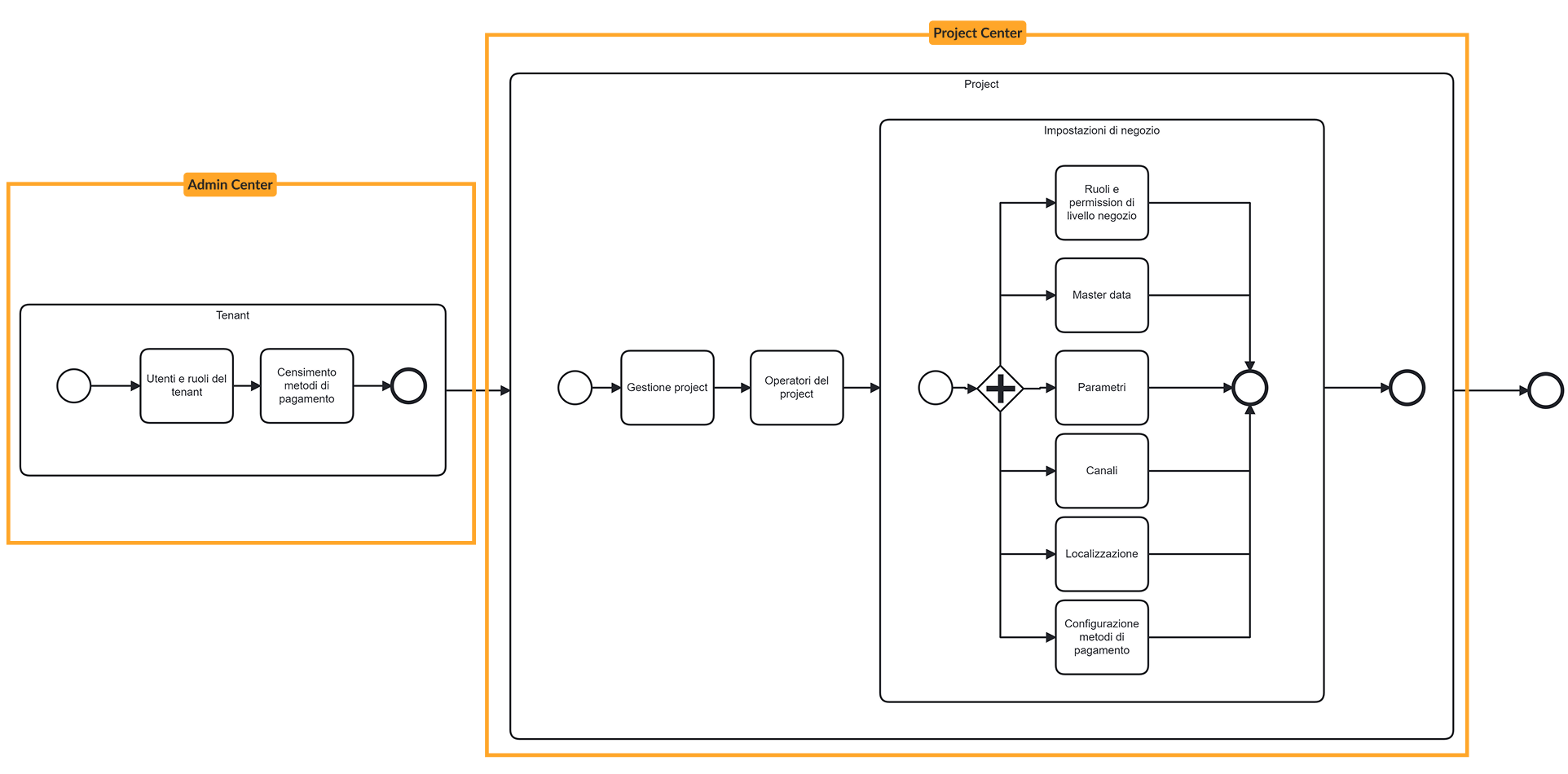
The system is structured into two main functional areas, designed to support the scalable governance and configuration of multiple whitelabel e-commerce platforms:
Admin Center:
→
Creation of Project Centers: each Project Center represents a configurable shop sold to end clients
→
User management: the Super Admin creates and manages accounts for users who will access the e-Commerce Portal
→
Governance & permissions: role definition, access levels, and multi-tenant management
e-Commerce Portal:
→
Shop Admin: - Project data & parameters, Sales channels, Localization
& taxation, Shipping & payment methods, User, roles & permission management -
→
Promotions: - Discount codes, Promotional campaigns -
→
PIM (detailed in a dedicated project section): - Catalogs, products, categories, and product types -
→
Orders & Quotes: Order monitoring and quote generation
→
Shopping Cart: Started carts and associated users
🎯
Goal:
Establish a scalable navigation structure supporting governance across multiple whitelabel shops
💬
Insight:
Differentiating Admin Center vs. e-Commerce Portal clarified roles, permissions, and flows


Shop Admin
Admin
Center
E-Commerce
Portal
Promotions
PIM
Orders
& Quotes
Shopping
Cart
📆
Planning & Release Roadmap:
Once the overall IA was approved, we collaborated on defining a shared release roadmap, including a Gantt chart structured by feature clusters and release priorities.(This planning was done closely with my UX Team Lead; later, I independently led roadmap and planning — detailed in the “Intranet Platform” case study).
PHASE 2 SUMMARY
→
Clarified system sections and dependencies
→
Split architecture into Admin Center vs. e-Commerce Portal
→
Created scalable foundation for multi-tenant governance
UX Research
IA
High-Fidelity
Our UX Approach
What We Prototyped
Complex UX Flows
Improvements
Documentation
Handoff Phase
Phase 3 → High Fidelity Prototyping
Our UX Approach
In agreement with the client, we worked directly in high-fidelity prototyping, using the existing Design System. The first step involved building the Navigation menu — the main structure of the navigation and layout.
This initial output gave the team a clear overview of the platform and helped speed up the development process.
🎯
Goal:
Create high-fidelity prototypes leveraging the design system for immediate validation
💬
Insight:
Defining consistent patterns (e.g., modal-first creation) ensured coherence and faster onboarding

Progetti

Collaboratori

Torna a lista progetti
Nome progetto 01

Pannello amministratore

Gestione progetto

Dati progetto
Impostazioni
Canali di vendita
Comunicazioni
Area di vendita

Collaboratori


PIM


Promozioni


Torna a lista progetti
Nome progetto 01

Pannello amministratore

Gestione progetto

Area di vendita

Configurazione
Imposte
Pagamenti
Spedizione
Collaboratori


PIM


Promozioni


Torna a lista progetti
Nome progetto 01

Pannello amministratore


PIM

Dashboard
Categorie
Cataloghi
Classi di articoli
Articoli
Collezioni

Promozioni


Torna a lista progetti
Nome progetto 01

Pannello amministratore


PIM


Promozioni

Dashboard
Codici Sconto
Campagne
NAVIGATION MENU
UX Research
IA
High-Fidelity
Our UX Approach
What We Prototyped
Complex UX Flows
Improvements
Documentation
Handoff Phase
Phase 3 → High Fidelity Prototyping
What We Prototyped
Each section was prototyped based on use cases shared by the Business Analysts, following the roadmap outlined in the Gantt chart.
Depending on the complexity, some flows were mapped beforehand, while others were directly explored through high-fidelity prototyping.
Prototypes were validated in joint sessions with the core team (PO, developers, and Business Analysts), where we gathered feedback, iterated designs, and redefined flows when needed.
🎯
Goal:
Test core flows against operator needs and dev feasibility
💬
Insight:
Prototypes confirmed that navigation matched operator mental models, reducing training overhead
USE CASE
(BA)
PROTOTYPE
(UX)
VALIDATION SESSION
(PO/DEV/BA)
ITERATION &
REDEFINITION


UX Research
IA
High-Fidelity
Our UX Approach
What We Prototyped
Complex UX Flows
Improvements
Documentation
Handoff Phase
Phase 3 → High Fidelity Prototyping
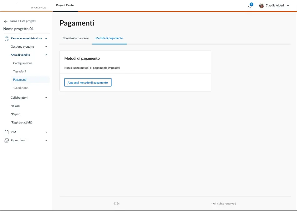
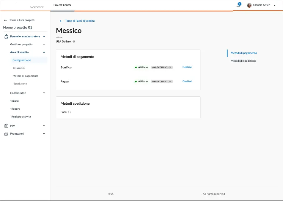
Complex UX Flows: Focus on Payment Methods setup flow
This section highlights the configuration flow for e-commerce payment methods, managed entirely within the internal backoffice.
The decisions made here directly impact what end users will see during checkout—making this a critical area for both business operations and user experience.
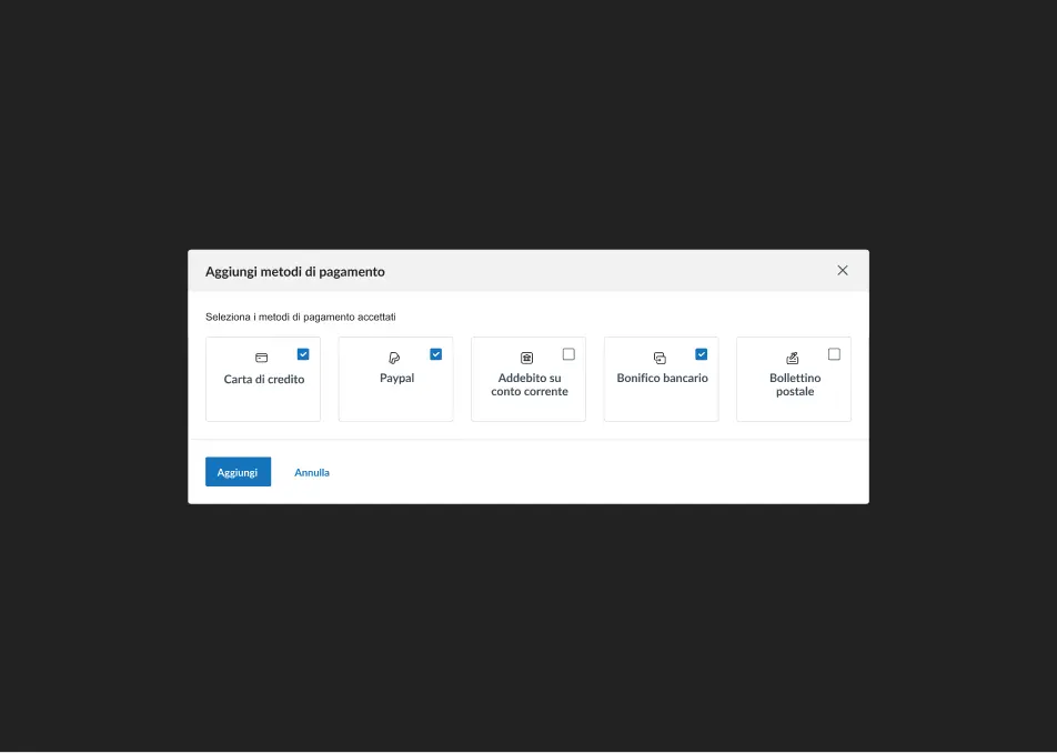
Enabling Payment Methods:The operator selects which payment methods to enable for the e-commerce platform.
Since this configuration happens in the backoffice, it defines the payment options that end users will see during their purchase experience. This setup balances business flexibility and UX consistency across different markets.
Multi-Access Configuration Logic:
The system was designed to support multiple access points to the same functions, enabling flexible workflows.
Operators can:
–> Start from the payment methods section, then navigate to a specific country’s configuration
–> Or start from a country-level setup, then access payment method settings
This reinforces a modular architecture and supports different mental models, depending on how operators approach their tasks.


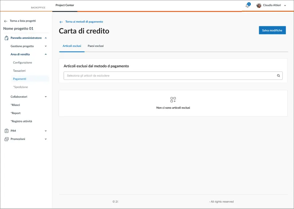
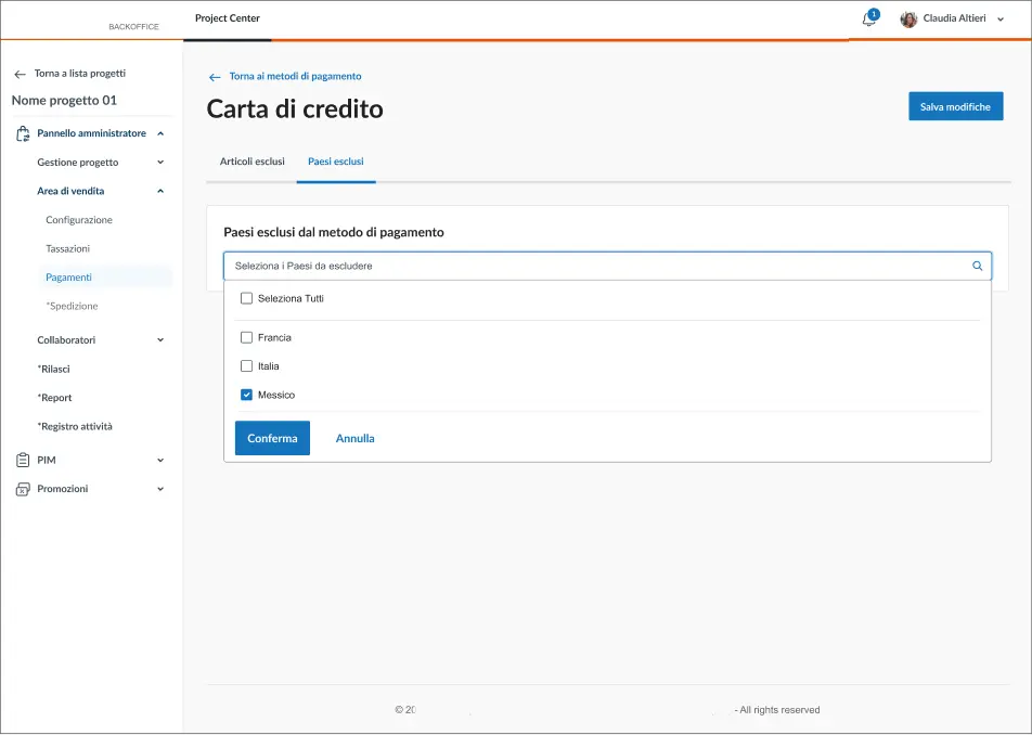
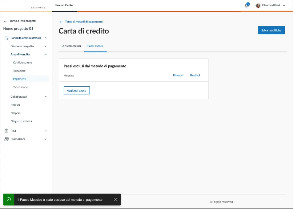
Payment Rules Management:
Once payment methods are enabled, each one can be managed in detail.
The operator can:
–> Exclude specific products from being purchased with a certain payment method
–> Restrict payment methods based on the user's country
This design ensures that business rules can be enforced at multiple levels while keeping the interface manageable.

UX Research
IA
High-Fidelity
Our UX Approach
What We Prototyped
Complex UX Flows
Improvements
Documentation
Handoff Phase
Phase 3 → High Fidelity Prototyping
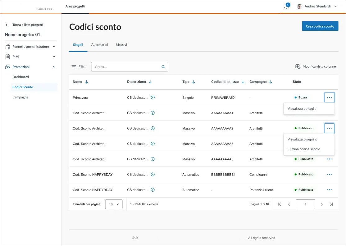
Complex UX Flows: Focus on Discount Codes setup flow
This section required collaboration with the Marketing team, who manage promotions and discount codes.
Their main requests included:
→ The ability to save and reuse promo templates, to speed up operations (e.g., when creating a discount during a support call)
→ Mass duplication of existing campaigns (e.g., Black Friday, Christmas), reducing repetitive work
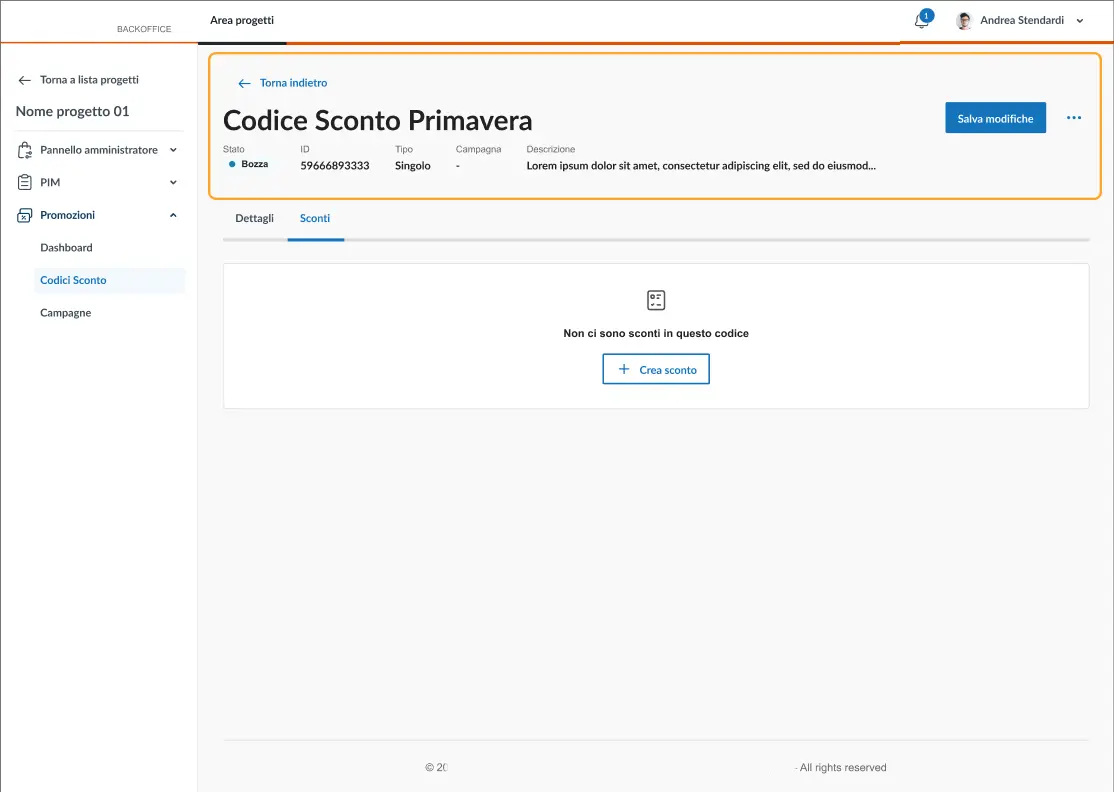
Discount Codes DASHBOARD:Shows all existing codes, related actions, and the option to create a new one.

Discount Code Creation Modal:Pattern defined by the PIM workstream: creation always starts from a modal with essential parameters, then continues in the full configuration flow.
Discount Code Configuration:The page is structured into:
- Header → info set in the modal + actions
- Tabs → configuration steps
- Parameters configuration → divided into blocks, supported by an anchor menu for long pages

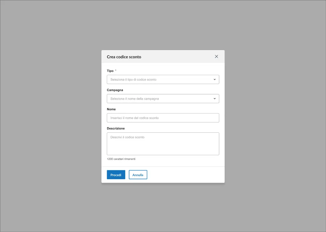
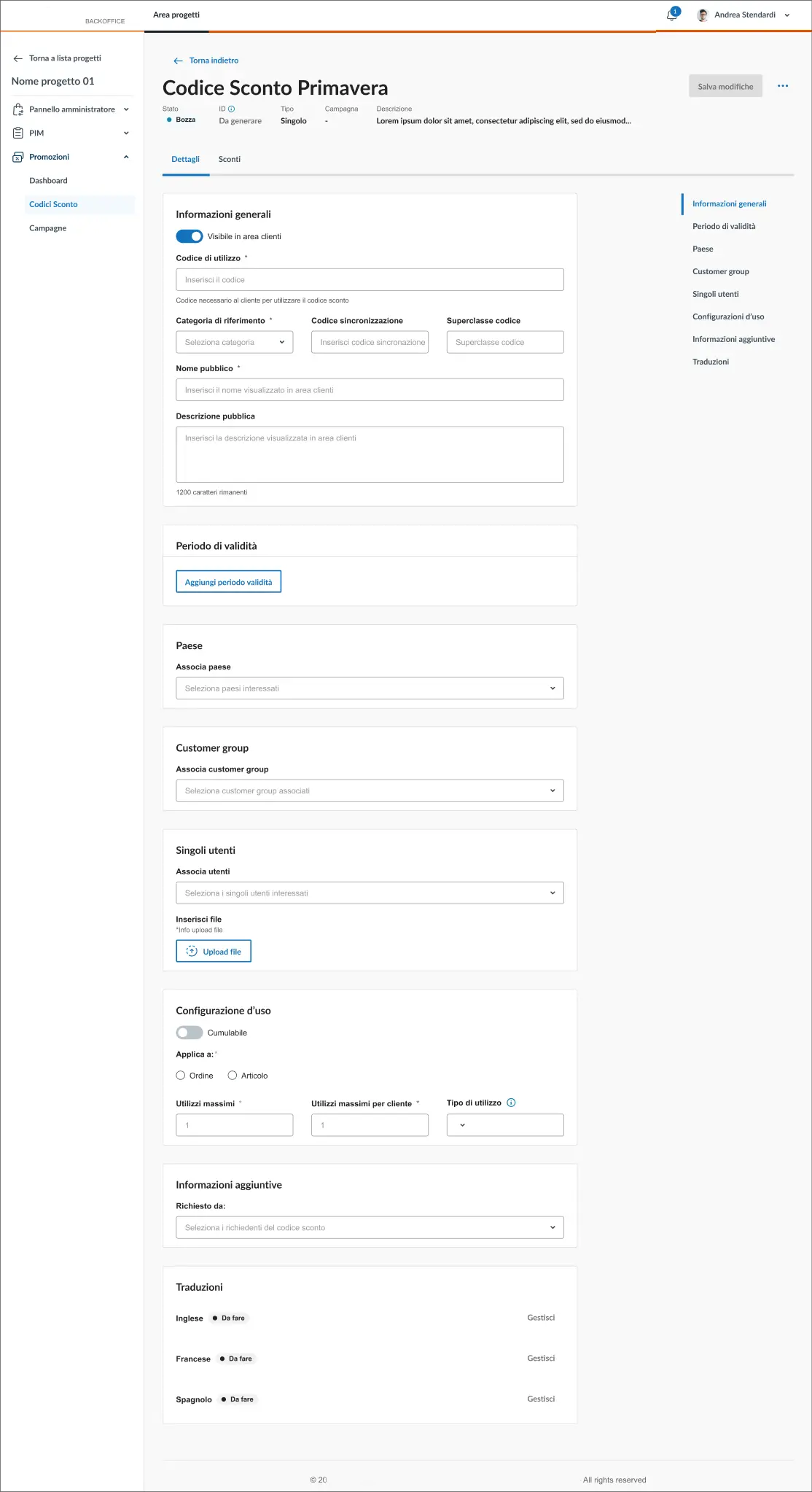
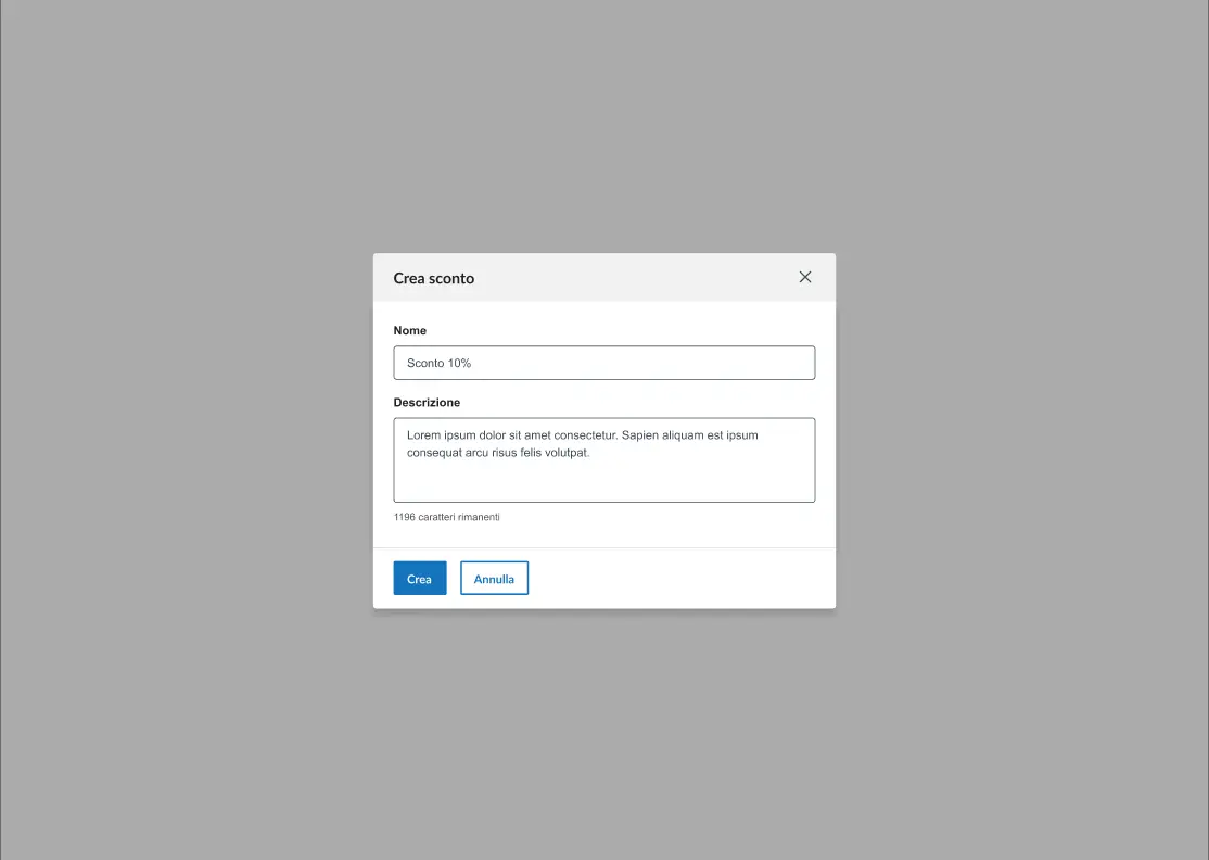
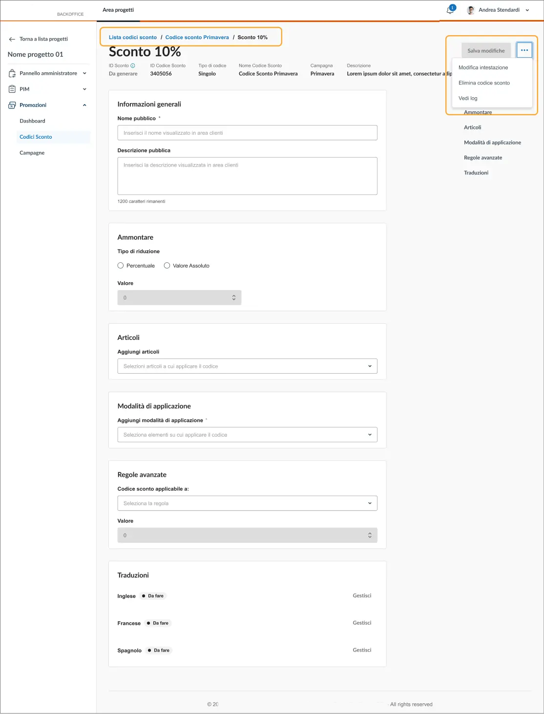
Action Buttons:
- Save changes (active only after mandatory fields are filled)
- Edit header (reopens modal, except for code type)
- Delete code
- Change status (publish once validations pass)
- Access logs


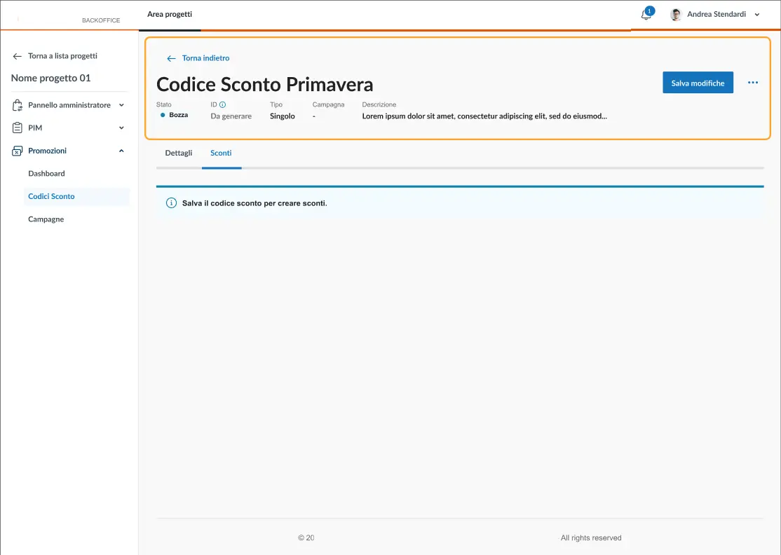
Step Progression: After completing the first step, the operator must save to unlock the next step. Logic was aligned with Functional Analysts and Developers to ensure backend consistency.
Validation Blocker: If the initial step is not saved, the operator cannot proceed further.

Consistent Flow:The same modal → header → full configuration logic applies to all discount codes.
Breadcrumb Navigation:Breadcrumbs follow a nested structure, giving operators full autonomy to navigate back to the main list or initial setup.

Save & Publish Logic:As across the platform, saving and publishing are only possible once all mandatory parameters are set.

UX Research
IA
High-Fidelity
Our UX Approach
What We Prototyped
Complex UX Flows
Improvements
Documentation
Handoff Phase
Phase 3 → High Fidelity Prototyping
Iteration & Improvements
During the high-fidelity prototyping, some flows turned out to be incomplete or unclear once translated into actual interface scenarios.
Concrete example:In the “Shop Team Management” section, the logic involved assigning users to a shop. However, it wasn’t defined where those users were created, making the assignment flow infeasible at that point.
We escalated this issue to the team and redefined the flow by introducing user creation in the “Admin Center” section.
To support this decision, we created a visual schema outlining the structure and content of each section. This visual aid was crucial: until the team saw it, it was difficult to align on the new logic or demonstrate the usability benefits of this structure.
🎯
Goal:
Refine flows through feedback and feasibility checks
💬
Insight:
Visual schemas exposed hidden gaps (e.g., user creation logic), enabling decisive alignment with devs
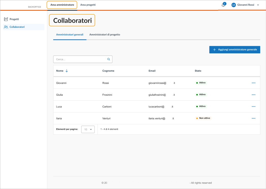
Admin Center → Creation of Project Centers, User management & Governance & permissions
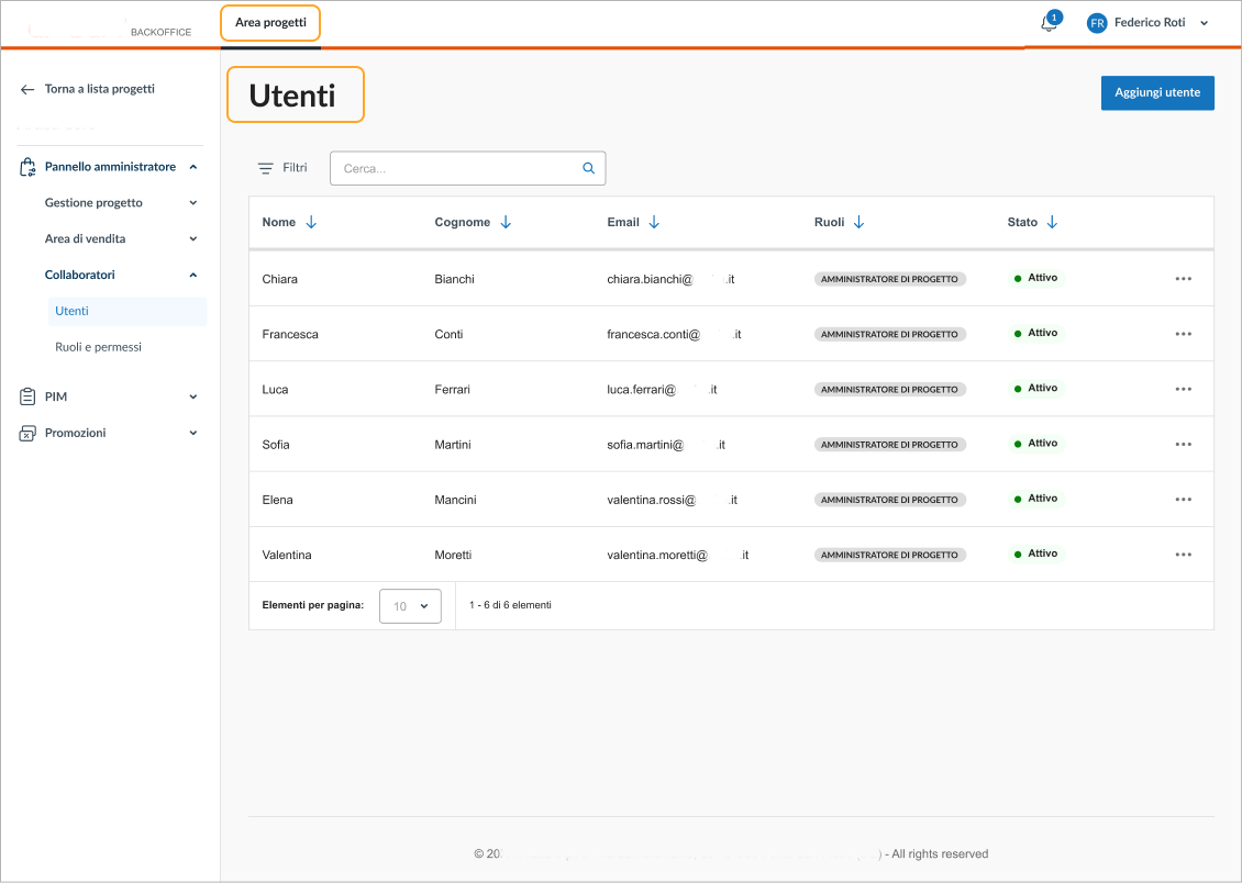
e-Commerce Portal - Shop Admin → User, roles & permission management
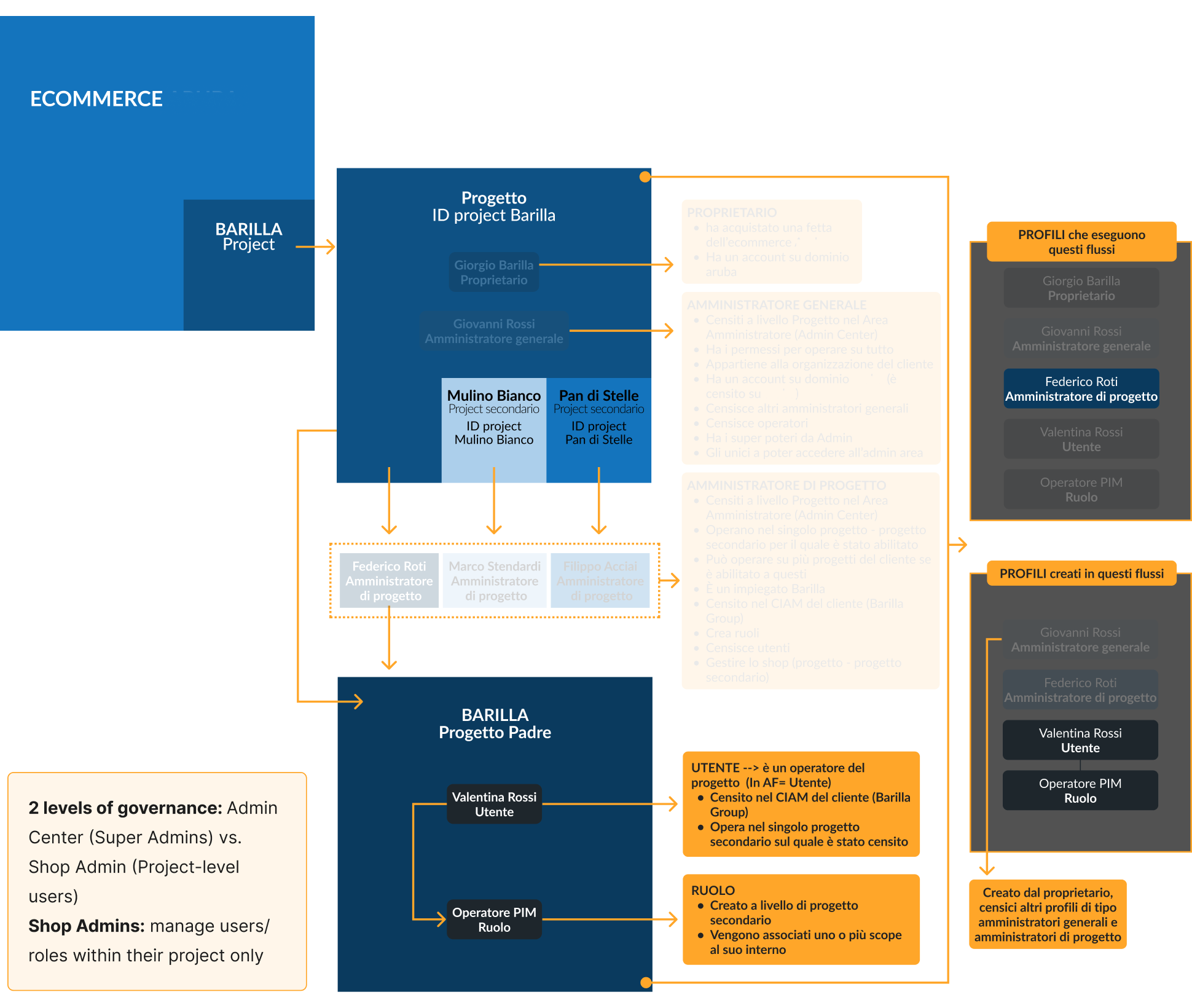
Admin Center → User management view
Shop Admin → User management view
UX Research
IA
High-Fidelity
Our UX Approach
What We Prototyped
Complex UX Flows
Improvements
Documentation
Handoff Phase
Phase 3 → High Fidelity Prototyping
Documentation
At the end of each section, we created structured internal wiki documentation to support both handoff and onboarding for development and business teams.
🎯
Goal:
Build a single source of truth for specs and decisions
💬
Insight:
Clear documentation reduced misalignment and supported incremental delivery
PHASE 3 SUMMARY
→
Prototyping validated flows and operator usability
→
Reinforced system-wide patterns for coherence
→
Deep dives ensured critical flows were scalable
→
Documentation reduced handoff friction
UX Research
IA
High-Fidelity
Handoff Phase
From UX to Dev
Phase 4 → Handoff Phase
From UX to Dev
After final validation, the prototypes were handed off to the development team.During implementation, we supported the process with an ongoing functional QA cycle:
→ Review of test outputs
→ Quick UX adjustments and fixes
→ Ongoing alignment sessions to adapt flows based on emerging technical constraints
(The project is currently in advanced development, with several sections already released in test environment and others in progressive rollout.)
PHASE 4 SUMMARY
→
Ensured handoff continuity through QA cycles
→
Reduced rework via early dev alignment
→
Delivered annotated prototypes for traceable implementation
Learnings & Takeaways
This project was a true training ground — from managing complexity to designing at scale and collaborating with both technical and strategic teams.
Below is a summary of key challenges → actions taken → skills developed.
CHALLENGE
ACTION TAKEN
SKILLS GAINED
Complex multi-tenant enterprise project — a first for me
In-depth analysis of requirements, scalable IA, full-remote management
Enterprise/SaaS B2B project handling, backend UX
New team, new dynamics: working with PO, devs, and business analysts
Onboarded as Senior UX, quickly gained autonomy, led complex flows
Operational leadership, ownership, adaptability
Large volume of documentation and unclear requirements
Fast synthesis, targeted questions, clear and coherent IA definition
Systems thinking, analytical speed, clarity
Technical and non-UX-friendly language from devs and analysts
Translated technical flows into usable and navigable solutions
Cross-disciplinary mediation, simplified design
No reference screens or existing visual materials
Envisioned experience and structure before UI phase
Abstraction, foresight, design vision
Unclear responsibilities in configuration management
Raised strategic questions, redefined roles and flows
Critical thinking, big-picture vision, functional accuracy
Tight timeline and modular project structure
Iterative work through shared milestones, precise hi-fi prototypes
Organization, time management, continuous iteration
Rigid and existing design system
Used available components, requested minimal new ones
Visual consistency, sustainable design, component thinking
Collaboration with marketing team on UX writing
Coordinated on technical and meaningful microcopy
Cross-team communication, terminological clarity
Long and information-heavy meetings
Produced concise and structured notes after every call
Operational synthesis, effective documentation
Continuously evolving project
Quick adaptation, frequent flow redefinition
Flexibility, change management, resilience
MORE PROJECTS
Enterprise Solutions / B2B Platform / Complex Workflows
Corporate Intranet
Platform
Transforming a legacy internal tool into a scalable, task-oriented intranet for customer service operators.
View Case Study
FINTECH / MOBILE APP / UX FLOWS
Push Notifications for Mobile Banking app
Enhancing UX with a clear and scalable communication system
View Case Study

SaaS SOLUTIONS / FROM COMPLEXITY TO CLARITY / SEAMLESS USER JOURNEYS
Building a Whitelabel
E-commerce Ecosystem
for a Global Tech Company
End-to-end UX design of a custom enterprise platform — from business needs to tested product.
OVERVIEW
The project was commissioned by a major Italian tech company, a leader in digital services such as hosting, domains, and data center infrastructure, with over 1,000 employees.
The goal was to design a scalable whitelabel e-commerce ecosystem, initially built for internal use but with a long-term vision of productizing it for third-party resale.
The platform was conceived as a custom enterprise solution, with complex flows, modular architecture, and distinct user groups — from super admins to shop operators — requiring flexible yet consistent user experiences.
ABOUT THE PROJECT
Role:
Senior UX Designer
Time:
Feb 2023 - Nov 2024
(UX completed, dev in progress)
Team:
4 UX Designers, 1 Product Owner,
3 Business Analysts, Dev Team
Cient:
Name withheld due to confidentiality agreements
Key Challenges
UX DESIGN CHALLENGES
→
Designing a scalable and modular information architecture
→
Translating ambiguous functional requirements into clear UX flows
→
Maintaining usability across enterprise-level complexity
→
Adapting flows for multiple user types and access levels
→
Designing within an existing, dense Design System
→
Prototyping configurable flows in a customizable white-label system
→
Supporting a gradual release strategy with iterative UX delivery
→
Aligning UX with legacy systems and backend logic
ORGANIZATIONAL & TEAM-RELATED CHALLENGES
→
Cross-functional alignment with technical and business stakeholders
→
Working fully remotely with a newly formed team
→
Managing large volumes of documentation and synthesizing it efficiently
→
Collaborating with non-UX teams (e.g., devs, business analysts, mkt)
→
Navigating stakeholder expectations and managing conflicting feedback
→
Building trust and ownership as a new Senior UX in a complex environment
The Process
UX RESEARCH
→
INFORMATION ARCHITECTURE
→
HIGH-FIDELITY PROTOTYPING
→
HANDOFF PHASE
UX Research
BR Analysis
Workshops
Benchmark
Functional mapping
IA
High-Fidelity
Handoff Phase
Phase 1 → UX Research
Business Requiriments Analysis
The project kicked off with the collection and deep analysis of the Business Requirements (BR) provided by the client.
We carefully reviewed, organized, and mapped the material to understand the scope, identify key functional areas, and outline initial questions.
This preparation phase was essential to structure the next step of stakeholder workshops.
🎯
Goal:
Align on business priorities and system constraints to set a realistic scope
💬
Insight:
Legacy limitations made it clear that simplification and clarity had to guide all design choices
UX Research
BR Analysis
Workshops
Benchmark
Functional mapping
IA
High-Fidelity
Handoff Phase
Stakeholder Workshops
We organized a series of collaborative workshops with brand representatives, functional analysts, and the dev team.
The goal was to validate or redefine functionalities mentioned in the BRs and to resolve technical ambiguities, especially regarding the PIM & configuration flows.
🎯
Goal:
Collect multiple perspectives and resolve functional ambiguities
💬
Insight:
Operators revealed that customer identification was always the real starting point, shifting the homepage from Dashboard → Customer Search

UX Research
BR Analysis
Workshops
Benchmark
Functional mapping
IA
High-Fidelity
Handoff Phase
Benchmark
We analyzed a range of B2B and B2C platforms (including Shopify, Liferay, and PimCore) by directly navigating demo environments or test instances. The goal was to gather UX references, understand structural patterns, and inform our thinking before defining the Information Architecture.
This was an exploratory activity — we didn’t create formal deliverables, but used these insights to align internally and validate design directions.
🎯
Goal:
Explore best practices from B2B/B2C systems to inspire solutions
💬
Insight:
B2C patterns could not be applied directly; they required adaptation to match the complexity of B2B operations
UX Research
BR Analysis
Workshops
Benchmark
Functional mapping
IA
High-Fidelity
Handoff Phase
Functional mapping
All findings were consolidated into a clear and actionable synthesis. We structured the outputs into functional clusters and user tasks, laying the groundwork for the next phase: Information Architecture. We used FigJam to organize documentation, workshop outcomes, and inputs from multiple teams in one shared and navigable workspace.
🎯
Goal:
Consolidate findings into clear functional clusters and user tasks
💬
Insight:
A shared workspace in FigJam helped unify scattered inputs and prepared the ground for IA design
PHASE 1 SUMMARY
→
Prioritized simplicity due to legacy constraints
→
Reframed homepage as Customer Search
→
Identified transferable patterns but adapted them for B2B
→
Created functional synthesis as a foundation for IA
UX Research
IA
Functional Analysis
IA
High-Fidelity
Handoff Phase
Phase 2 → Information Architecture
Functional Analysis
Once the research phase was completed, we moved on to the information architecture design of the platform.
We defined the core functionalities and mapped the key system sections, based on the priorities aligned with the project team.
Several meetings were held with the project team to present two IA proposals. After evaluating different perspectives and testing scalability, we aligned on the most functional and future-proof structure.
🎯
Goal:
Define system sections based on service logic and project priorities
💬
Insight:
Workshops exposed gaps in functional specs, making UX facilitation critical for alignment

Shop configuration


Shop Admin
Promotions
PIM
Admin Center
Project Center


Shop Admin
Promotions
PIM
Shop
configuration
Admin Center
Project Center
The main difference between the two proposals concerned where to place the shop configuration section (localization, taxes, payments, shipping, etc.).
It was not initially clear—based on the Business Requirements and inputs from the Business Analysts — whether these settings should belong to the single project’s management panel (Project Center), or if they were to be managed exclusively by the Super Admin, and therefore placed at the Tenant level.
UX Research
IA
Functional Analysis
IA
High-Fidelity
Handoff Phase
Information Architecture
The system is structured into two main functional areas, designed to support the scalable governance and configuration of multiple whitelabel e-commerce platforms:
Admin Center:
→
Creation of Project Centers: each Project Center represents a configurable shop sold to end clients
→
User management: the Super Admin creates and manages accounts for users who will access the e-Commerce Portal
→
Governance & permissions: role definition, access levels, and multi-tenant management
e-Commerce Portal:
→
Shop Admin: - Project data & parameters, Sales channels, Localization
& taxation, Shipping & payment methods, User, roles & permission management -
→
Promotions: - Discount codes, Promotional campaigns -
→
PIM (detailed in a dedicated project section): - Catalogs, products, categories, and product types -
→
Orders & Quotes: Order monitoring and quote generation
→
Shopping Cart: Started carts and associated users
🎯
Goal:
Establish a scalable navigation structure supporting governance across multiple whitelabel shops
💬
Insight:
Differentiating Admin Center vs. e-Commerce Portal clarified roles, permissions, and flows


Shop Admin
Admin
Center
E-Commerce
Portal
Promotions
PIM
Orders & Quotes
Shopping Cart
📆
Planning & Release Roadmap:
Once the overall IA was approved, we collaborated on defining a shared release roadmap, including a Gantt chart structured by feature clusters and release priorities.(This planning was done closely with my UX Team Lead; later, I independently led roadmap and planning — detailed in the “Intranet Platform” case study).
PHASE 2 SUMMARY
→
Clarified system sections and dependencies
→
Split architecture into Admin Center vs. e-Commerce Portal
→
Created scalable foundation for multi-tenant governance
UX Research
IA
High-Fidelity
Our UX Approach
What We Prototyped
Complex UX Flows
Improvements
Documentation
Handoff Phase
Phase 3 → High Fidelity Prototyping
Our UX Approach
In agreement with the client, we worked directly in high-fidelity prototyping, using the existing Design System. The first step involved building the Navigation menu — the main structure of the navigation and layout.
This initial output gave the team a clear overview of the platform and helped speed up the development process.
🎯
Goal:
Create high-fidelity prototypes leveraging the design system for immediate validation
💬
Insight:
Defining consistent patterns (e.g., modal-first creation) ensured coherence and faster onboarding

Progetti

Collaboratori

Torna a lista progetti
Nome progetto 01

Pannello amministratore

Gestione progetto

Dati progetto
Impostazioni
Canali di vendita
Comunicazioni
Area di vendita

Collaboratori


PIM


Promozioni


Torna a lista progetti
Nome progetto 01

Pannello amministratore

Gestione progetto

Area di vendita

Configurazione
Imposte
Pagamenti
Spedizione
Collaboratori


PIM


Promozioni


Torna a lista progetti
Nome progetto 01

Pannello amministratore


PIM

Dashboard
Categorie
Cataloghi
Classi di articoli
Articoli
Collezioni

Promozioni


Torna a lista progetti
Nome progetto 01

Pannello amministratore


PIM


Promozioni

Dashboard
Codici Sconto
Campagne
NAVIGATION MENU
UX Research
IA
High-Fidelity
Our UX Approach
What We Prototyped
Complex UX Flows
Improvements
Documentation
Handoff Phase
What We Prototyped
Each section was prototyped based on use cases shared by the Business Analysts, following the roadmap outlined in the Gantt chart.
Depending on the complexity, some flows were mapped beforehand, while others were directly explored through high-fidelity prototyping.
Prototypes were validated in joint sessions with the core team (PO, developers, and Business Analysts), where we gathered feedback, iterated designs, and redefined flows when needed.
🎯
Goal:
Test core flows against operator needs and dev feasibility
💬
Insight:
Prototypes confirmed that navigation matched operator mental models, reducing training overhead
USE CASE
(BA)
PROTOTYPE
(UX)
VALIDATION SESSION
(PO/DEV/BA)
ITERATION &
REDEFINITION


UX Research
IA
High-Fidelity
Our UX Approach
What We Prototyped
Complex UX Flows
Improvements
Documentation
Handoff Phase
Complex UX Flows: Focus on Payment Methods setup flow
This section highlights the configuration flow for e-commerce payment methods, managed entirely within the internal backoffice.
The decisions made here directly impact what end users will see during checkout—making this a critical area for both business operations and user experience.
Enabling Payment Methods:The operator selects which payment methods to enable for the e-commerce platform.
Since this configuration happens in the backoffice, it defines the payment options that end users will see during their purchase experience. This setup balances business flexibility and UX consistency across different markets.
Payment Rules Management:
Once payment methods are enabled, each one can be managed in detail.
The operator can:
–> Exclude specific products from being purchased with a certain payment method
–> Restrict payment methods based on the user's country
This design ensures that business rules can be enforced at multiple levels while keeping the interface manageable.
Multi-Access Configuration Logic:
The system was designed to support multiple access points to the same functions, enabling flexible workflows.
Operators can:
–> Start from the payment methods section, then navigate to a specific country’s configuration
–> Or start from a country-level setup, then access payment method settings
This reinforces a modular architecture and supports different mental models, depending on how operators approach their tasks.


UX Research
IA
High-Fidelity
Our UX Approach
What We Prototyped
Complex UX Flows
Improvements
Documentation
Handoff Phase
Complex UX Flows: Focus on Discount Codes setup flow
This section required collaboration with the Marketing team, who manage promotions and discount codes.
Their main requests included:
→ The ability to save and reuse promo templates, to speed up operations (e.g., when creating a discount during a support call)
→ Mass duplication of existing campaigns (e.g., Black Friday, Christmas), reducing repetitive work
Discount Codes DASHBOARD:Shows all existing codes, related actions, and the option to create a new one.

Discount Code Creation Modal:Pattern defined by the PIM workstream: creation always starts from a modal with essential parameters, then continues in the full configuration flow.
Discount Code Configuration:The page is structured into:
- Header → info set in the modal + actions
- Tabs → configuration steps
- Parameters configuration → divided into blocks, supported by an anchor menu for long pages

Action Buttons:
- Save changes (active only after mandatory fields are filled)
- Edit header (reopens modal, except for code type)
- Delete code
- Change status (publish once validations pass)
- Access logs

Step Progression: After completing the first step, the operator must save to unlock the next step. Logic was aligned with Functional Analysts and Developers to ensure backend consistency.
Validation Blocker: If the initial step is not saved, the operator cannot proceed further.

Consistent Flow:The same modal → header → full configuration logic applies to all discount codes.
Breadcrumb Navigation:Breadcrumbs follow a nested structure, giving operators full autonomy to navigate back to the main list or initial setup.

Save & Publish Logic:As across the platform, saving and publishing are only possible once all mandatory parameters are set.

UX Research
IA
High-Fidelity
Our UX Approach
What We Prototyped
Complex UX Flows
Improvements
Documentation
Handoff Phase
Iteration & Improvements
During the high-fidelity prototyping, some flows turned out to be incomplete or unclear once translated into actual interface scenarios.
Concrete example:In the “Shop Team Management” section, the logic involved assigning users to a shop. However, it wasn’t defined where those users were created, making the assignment flow infeasible at that point.
We escalated this issue to the team and redefined the flow by introducing user creation in the “Admin Center” section.
To support this decision, we created a visual schema outlining the structure and content of each section. This visual aid was crucial: until the team saw it, it was difficult to align on the new logic or demonstrate the usability benefits of this structure.
🎯
Goal:
Refine flows through feedback and feasibility checks
💬
Insight:
Visual schemas exposed hidden gaps (e.g., user creation logic), enabling decisive alignment with devs
Admin Center → Creation of Project Centers, User management & Governance & permissions
e-Commerce Portal - Shop Admin → User, roles & permission management
Admin Center → User management view
Shop Admin → User management view
UX Research
IA
High-Fidelity
Our UX Approach
What We Prototyped
Complex UX Flows
Improvements
Documentation
Handoff Phase
Documentation
At the end of each section, we created structured internal wiki documentation to support both handoff and onboarding for development and business teams.
🎯
Goal:
Build a single source of truth for specs and decisions
💬
Insight:
Clear documentation reduced misalignment and supported incremental delivery
PHASE 3 SUMMARY
→
Prototyping validated flows and operator usability
→
Reinforced system-wide patterns for coherence
→
Deep dives ensured critical flows were scalable
→
Documentation reduced handoff friction
UX Research
IA
High-Fidelity
Handoff Phase
From UX to Dev
Phase 4 → Handoff Phase
From UX to Dev
After final validation, the prototypes were handed off to the development team.During implementation, we supported the process with an ongoing functional QA cycle:
→ Review of test outputs
→ Quick UX adjustments and fixes
→ Ongoing alignment sessions to adapt flows based on emerging technical constraints
(The project is currently in advanced development, with several sections already released in test environment and others in progressive rollout.)
PHASE 4 SUMMARY
→
Ensured handoff continuity through QA cycles
→
Reduced rework via early dev alignment
→
Delivered annotated prototypes for traceable implementation
Learnings & Takeaways
This project was a true training ground — from managing complexity to designing at scale and collaborating with both technical and strategic teams.
Below is a summary of key challenges → actions taken → skills developed.
CHALLENGE
ACTION TAKEN
SKILLS GAINED
Complex multi-tenant enterprise project — a first for me
In-depth analysis of requirements, scalable IA, full-remote management
Enterprise/SaaS B2B project handling, backend UX
New team, new dynamics: working with PO, devs, and business analysts
Onboarded as Senior UX, quickly gained autonomy, led complex flows
Operational leadership, ownership, adaptability
Large volume of documentation and unclear requirements
Fast synthesis, targeted questions, clear and coherent IA definition
Systems thinking, analytical speed, clarity
Technical and non-UX-friendly language from devs and analysts
Translated technical flows into usable and navigable solutions
Cross-disciplinary mediation, simplified design
No reference screens or existing visual materials
Envisioned experience and structure before UI phase
Abstraction, foresight, design vision
Unclear responsibilities in configuration management
Raised strategic questions, redefined roles and flows
Critical thinking, big-picture vision, functional accuracy
Tight timeline and modular project structure
Iterative work through shared milestones, precise hi-fi prototypes
Organization, time management, continuous iteration
Rigid and existing design system
Used available components, requested minimal new ones
Visual consistency, sustainable design, component thinking
Collaboration with marketing team on UX writing
Coordinated on technical and meaningful microcopy
Cross-team communication, terminological clarity
Long and information-heavy meetings
Produced concise and structured notes after every call
Operational synthesis, effective documentation
Continuously evolving project
Quick adaptation, frequent flow redefinition
Flexibility, change management, resilience
MORE PROJECTS
Enterprise Solutions / B2B Platform / Complex Workflows
Corporate Intranet
Platform
Transforming a legacy internal tool into a scalable, task-oriented intranet for customer service operators.
View Case Study
FINTECH / MOBILE APP / UX FLOWS
Push Notifications for
Mobile Banking app
Enhancing UX with a clear and scalable communication system
View Case Study